Tuesday, September 30, 2014

Academic Shoot Preview


Filling the Frame 

This is filling in the frame because there is a lot of things going on and every body is filling the space up.


                                                                                         Action and Emotion

         This is action and emotion because it is doing something good for the community and you can tell in her face that she is very emotional for planting


The Story

This is the story because it is showing how helpful they are for the food drive for the homeless/the needy.


I picked the photo because it was very unique and i have never seen it before. Balance was one of the rules of photography because the bubble is framing the person inside.


Monday, September 22, 2014

Element of Art and Principles of Design

Color: Color wheels show the primary colors, secondary colors, and the tertiary (intermediate) colors.

Basically everything that isn't black or white is color that you can see. There are very bright colors that you can really see and it brings the effect of color.
Value: Value, or tone, refers to dark and light; the value scale refers to black and white with all gradations of gray in between.
The value is basically contrast and you can see all the colors in the photo. The elephants really contrast from the girl in the white dress. to bring value.
Texture: Texture can be rough, bumpy, slick, scratchy, smooth, silky, soft, prickly--the list is endless.
 You can see the rough texture and how scratchy it really is. You can see the scratchy tires and plenty of them.
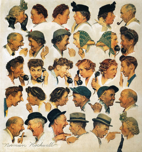
Shape: Shapes are formed wherever the ends of a continuous line meet.
These show shape because they both have a circular shape.
Form: Form describes objects that are three-dimensional, having length, width, and height.
This photo is a good picture for form because it shows the form of their faces. The babes face shows a form and basically everything else with the picture.
Space: Space refers to distances or areas around, between, or within components of a piece.
These are good pictures of space because they have simplicity. The bird is sort of showing the rule of thirds and has plenty of space.
Line: Lines are marks made by a pointed tool: brush, pencil, pen, etc. Lines can vary in width, direction, curvature, length, or color.
These are good photos of lines because they have either small or big curved lines. This picture has plenty of curved lines and a few small short ones.
Balance: Balance is the comfortable or pleasing arrangement of things in art.
They can be folded on top of each other and they will be pretty balances. If it has an even number of objects next o each other then it could follow balance.
Contrast: Contrast is created by using elements that conflict with one another.
You can see the different colors and see when the color is formed. The red contrast throughout the green grass.
Emphasis: Emphasis in the focal area of an artwork gives it importance.
This focuses on one thing and nothing else. There are plenty of bottle tops and it just focuses on only one.
Movement: Movement in an artwork means the artist is taking viewers on a trip through the work by means of lines, edges, shapes, and colors often leading to the focal area.

Unity: Unity means that all elements in an artwork are in harmony.

The pictures and the images in them flow together. The picture of the people holding hands flows in a circle.
Rhythm: Rhythm is the repetition of shapes, lines, and forms.

This is a repetition of the same shape plenty of times. Circles are the repeated things in the picture which brings a rhythm
Pattern: Patterns are made in art when the same shapes or elements are repeated again and again.
These are good pictures for pattern because it is the same shape repeatedly. Whatever the man is standing of continues in a circular motion and is a pattern.

Tuesday, September 16, 2014

Photo Composition Shoot

Avoiding Mergers
This is a good photo for avoiding mergers because I initially took a picture of the Akins Yearbook sign but there is a head that interfered with my photo.

Balance 
This is a good photo for balance because there are two people in the photo, next to each other, wearing the same shirt.

Frame
This is a good picture of frame because the walls are the sides. the ceiling is the top and the floor is the bottom of the picture.

Lines
This is a good picture for lines because the lines are going down and the lines are horizontal so it draws your eyes from bottom to top.

Simplicity
This is a good picture for simplicity because it is a single picture which nothing in the background to mess with the person in the picture.

The Rule of Thirds
This is a good picture of the rule of thirds because is is basically in the bottom left corner.

Friday, September 12, 2014

Photo Composition

Balance
This is a good photo for composition of balance because it is nearly centered and it shows an equal amount of fans in the crowd.

Rule of Thirds
This is a good photo for composition of the rule of thirds because the ball is in the left middle section.

Lines
This is a good photo of composition of lines because of the lines on the football fields and how they are equally spaced out.

Simplicity
This is a good photo of simplicity because it is just focusing on the football player and nothing else.

Frame
This is a good photo of frame because the goal post are making it where you are looking through it.

Avoiding Mergers
This is a good photo of avoiding mergers because there is too much to focus on. 

Photo Subjects in Your World

This is my favorite photo because it is taken with excellent timing. Also because I can see the contrast of the water, the ice, and the dolphins. I liked how it was focused on the dolphins are spitting out.

I would like to take a picture of basketball playing all around the world to see the different ways each country plays like. I would enter it because majority of the people in the world have a different style of playing basketball and i would want to compare them. 

Wednesday, September 10, 2014

Peer Reflection

Peer Reflection 

Things Good: Very good camera position and I like how he center his photos. 
One thing that needs to be improved is to make sure each photo has equal light.

Blog: http://tigersgraphicdesignblog00.blogspot.com

Monday, September 8, 2014

Color, Shape and Contrast

Color

Contrast

Shape

Camera History

Part 1

1. The "camera obscura" effect is basically a small room that is completely dark with a tiny hole in the wall.
2. The modern camera was the invention during the 17th Century helped man get a step closer to creating the modern camera.
3. A glass lens, a dark box and film were the first modern camera invented by Niepce.
4. A glass lens is what they had in common with Niepce's camera.
5. They use film to capture images.
6. Auto will use flash and program will not.
7. Portrait mode is used for focusing on a main object and to blur out the objects in the back.
8. Sports mode is for action/motion photos.
9. You should do a half press on the trigger button to focus on the image.
10. The flash is not on and when you are in light.
11. The flash is on and when you are in a dark place.
12. If the photo is too bright you won't be able to see the image.
13. If the photo is not too bright then you won't be able to see the image at all.
14. A stop is to show a change in brightness.
15. It is 1 stop brighter.
16. It is 4 stops brighter.
17. The longer shutter speed makes it brighter.
18. The shorter shutter speed  makes is dimmer.
19. The aperture controls light.
20. You can increase the amount of light with flash.

Part 2

-Aperture to left
Inside: Gets bigger
Image: Makes it brighter
-Aperture to right
Inside: Gets smaller
Image: Makes it dimmer
-Shutter to left
Inside: Takes slower pictures
Image: White picture
-Shutter to right
Inside: Takes faster pictures
Image: Black picture
-ISO to left
Inside: Little light
Image: Clear picture
-ISO to right
Inside: A lot of light
Image: White picture

Thursday, September 4, 2014

Evaluating Photos


Associated Press / AP
A photo that has interesting composition
I liked it because of how racism was in the 1900's and i respected what they did. It is on the top 40 because it was a sign of respect.

LOUIE FAVORITE 
A photo that attracted me emotionally
I liked it because I don't know what it would be like if i didn't see my mom in 7 months at a young age. It was on the to 40 because of how she reunited with her daughter for nearly a year.

"SCHOOL BLOCKED"
A photo that has surprising and unexpected content
I liked it because it involves race and it is nice to see blacks and whites together not discriminating. It was on the top 40 because, again racism was a big issue back in the day.

Apollo 8/Nasa
A photo that has pretty imagery
I liked the picture because of how the Moon looks on the surface and how Earth looks. It was on the top 40 because the angle that they took it from was very creative and had to take a lot of effort to do.